DAG Construction: How to Draw a Causal Graph Before You Touch the Model
Most bad adjustment strategies are born long before the regression table. They start when someone never makes the causal structure explicit, throws every available variable into a model, and calls that “rigorous.” A good directed acyclic graph — a DAG — forces you to say what causes what, what happens before what, and what should not be conditioned on. That is why DAG construction is not decorative. It is design work.
In this guide
- 1. Why DAG construction matters before any model
- 2. What a DAG is, and what it is not
- 3. Start with the causal question, not the variable list
- 4. Time ordering: the part people keep screwing up
- 5. How to choose nodes and arrows
- 6. Confounders, mediators, colliders, and proxies
- 7. Clinical example: ICU sedation and delirium
- 8. From graph to adjustment set
- 9. Eight common DAG mistakes
- 10. What a serious paper should report
1. Why DAG construction matters before any model
A DAG is a compact statement of your causal beliefs. It tells the reader which variables create confounding, which variables sit on the causal pathway, which variables are colliders, and which paths need to be blocked to identify the effect you actually care about. If you skip that step, adjustment becomes a vibes-based activity.
The blunt version
“We adjusted for all available covariates” is not a strength. It is usually a confession that no one thought carefully about causality.
The value of a DAG is not that it makes you look sophisticated. The value is that it makes your assumptions visible enough to be challenged. Hidden assumptions are where bad epidemiology goes to survive peer review.
2. What a DAG is, and what it is not
A DAG is a directed graph because arrows point from causes to effects. It is acyclicbecause you are not allowed to draw feedback loops inside the same time slice. If A causes B, B causes C, and C causes A, you either have the wrong time indexing or you need repeated time points rather than a single cross-sectional picture.
A DAG is for
- • Making temporal and causal assumptions explicit
- • Identifying confounding and collider structures
- • Choosing a minimally sufficient adjustment set
- • Explaining why some variables should be left out
A DAG is not for
- • Summarizing associations only
- • Showing every measured variable just because you have it
- • Replacing domain knowledge with software defaults
- • Pretending uncertainty disappears once a graph exists
My take: the best DAGs are brutally simple. If your graph needs a keynote animation and a motivational speech, it probably is not doing the job.
3. Start with the causal question, not the variable list
Before you draw a single node, define the exposure, outcome, target population, and estimand. Are you asking about treatment initiation, treatment intensity, policy exposure, or adherence? Is the outcome short-term mortality, 1-year functional recovery, or biomarker change? Different questions produce different DAGs.
Useful rule
If you cannot write your causal question in one sentence, you are not ready to draw the graph. You are still collecting nouns.
This matters because “sedation” and “deep sedation in the first 24 hours of ICU admission” are not the same exposure. “Delirium” and “delirium assessed after extubation using CAM-ICU” are not the same outcome. DAGs force that precision.
4. Time ordering: the part people keep screwing up
The fastest way to ruin a DAG is to ignore timing. Variables only make causal sense if you know when they happen. Baseline severity can affect treatment choice. A post-treatment lab value cannot confound treatment assignment that already happened. A discharge variable cannot cause an admission exposure unless you have invented time travel.
Put baseline variables on the left
Demographics, preexisting disease, prior utilization, and baseline severity should precede treatment in the graph if they genuinely come first.
Put the exposure at a defined time zero
Do not draw a fuzzy treatment node if the intervention unfolds over time. Define what counts as exposure and when it starts.
Separate post-treatment events
Complications, adherence, biomarkers, and care intensity after treatment initiation belong downstream, not alongside baseline confounders.
Use multiple time points when needed
If feedback exists over time, a single static DAG may hide the real problem. Expand the graph instead of lying with a simpler picture.
If your graph ignores time, your “confounders” will quietly become mediators, and your adjustment set will quietly become a bias generator.
5. How to choose nodes and arrows
A node should represent a concept that matters for the causal question, not every column in your spreadsheet. Start with broad constructs, then split nodes only when the distinction changes your causal logic. The graph is about causes, not data dictionary completeness.
Arrow direction should come from subject-matter knowledge, temporal logic, and mechanism. Correlation matrices are useless here. A variable can predict another variable without causing it. DAGs are where you stop confusing prediction with causation.
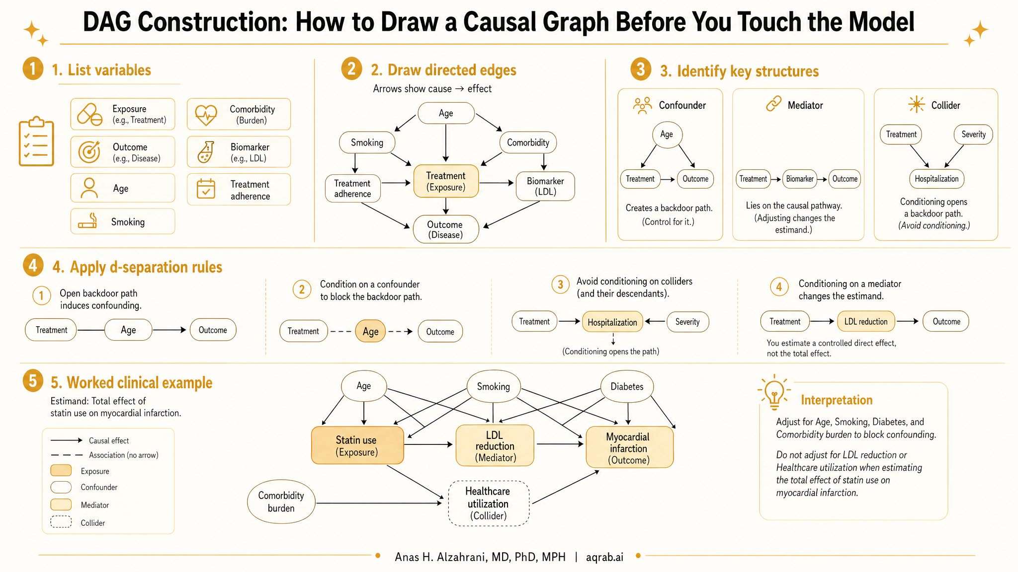
6. Confounders, mediators, colliders, and proxies
Confounder
A common cause of exposure and outcome. Adjusting for it helps block a backdoor path.
Mediator
A variable on the causal path from exposure to outcome. Adjusting for it changes the estimand and often blocks part of the effect you wanted.
Collider
A common effect of two variables. Conditioning on it opens a noncausal path and can create bias out of thin air.
Proxy
A measured stand-in for some underlying construct. Proxies can help, but they do not magically inherit the exact causal role of the thing they approximate.
The collider problem is where a lot of smart people embarrass themselves. Hospital admission, treatment receipt, being tested, and surviving long enough to be measured are often colliders or descendants of colliders. If you condition on them casually, congratulations — you just built selection bias into the study and called it adjustment.
7. Clinical example: ICU sedation and delirium
Suppose you want the effect of early deep sedation on ICU delirium. The instinctive model is to adjust for everything recorded in the first 48 hours. That is exactly how people get burned.
Exposure
Deep sedation during the first 24 hours after ICU admission.
Outcome
Incident delirium after sedation exposure window.
Likely baseline confounders
Severity of illness, mechanical ventilation indication, baseline neurologic status, age, prior dementia, shock severity.
Potential mediators or post-treatment variables
Hypotension after sedation, prolonged ventilation, restraint use, sleep disruption, later sedative dose escalation.
Potential collider trap
Conditioning on remaining intubated at 48 hours, if both severe illness and sedation affect that status.
In that graph, severity of illness belongs upstream. Delirium belongs downstream. Ventilation duration after exposure may be a mediator, a collider descendant, or part of a selection process depending on the design. This is why the graph comes before the model formula.
8. From graph to adjustment set
Once the DAG is drawn, your job is to block the open backdoor paths from exposure to outcome without blocking the causal pathway itself. That usually means finding a minimally sufficient adjustment set: enough variables to control confounding, but not a kitchen sink.
Good adjustment logic
Adjust for common causes of exposure and outcome. Do not adjust for mediators, colliders, or descendants of colliders unless your estimand explicitly requires it.
Software like DAGitty can help enumerate valid sets, but it cannot rescue a bad graph. Garbage DAG in, garbage adjustment set out. The software is a calculator, not an epistemology engine.
9. Eight common DAG mistakes
1. Drawing arrows from association rather than mechanism
If the only reason an arrow exists is that two variables are correlated, you are drawing a predictive network, not a causal graph.
2. Treating every post-treatment variable like a confounder
Post-treatment variables often mediate or select. Adjusting for them casually is one of the cleanest ways to bias an estimate.
3. Ignoring selection into the dataset
Being hospitalized, tested, enrolled, or surviving to follow-up can induce collider bias if not handled explicitly.
4. Using one graph for multiple estimands
A total effect question and a direct effect question do not necessarily share the same useful adjustment strategy.
5. Overcomplicating the graph until nobody can critique it
Complexity can hide assumptions just as effectively as omission.
6. Leaving out unmeasured causes because they were not collected
Unmeasured variables still belong in a conceptual DAG if they matter causally. Measurement is not existence.
7. Failing to show time zero
Without a defined intervention start, the graph quietly tolerates immortal time bias and temporal nonsense.
8. Assuming a DAG proves identification
A DAG can justify a strategy under assumptions. It does not verify those assumptions are true in your data.
10. What a serious paper should report
A one-sentence causal question with explicit exposure, outcome, and time zero
A readable DAG in the main paper or supplement, not just a hand-wave toward “causal reasoning”
A short justification for each major arrow using clinical or design knowledge
Which variables were considered baseline confounders, mediators, colliders, and selection variables
The minimally sufficient adjustment set implied by the graph
Whether any important causes were unmeasured and how that limits identification
What estimand the graph is supporting: total effect, direct effect, or dynamic regime effect
Why excluded variables were excluded, especially if reviewers might expect to see them in the model
Any sensitivity analyses motivated by uncertain arrows or alternative graph structures
Plain-language interpretation of how the DAG changed the analysis plan
A reviewer does not need to agree with every arrow. They need to see that your design choices came from causal logic rather than statistical superstition. That alone puts you ahead of a depressing amount of the literature.
Try Aqrab free
Paste your protocol, covariate list, or draft DAG and get a structured critique before you lock yourself into the wrong adjustment set.
Keep reading
Don't stop at one method.
Good methods judgment comes from contrast. Read the neighboring guides, see where the assumptions diverge, and avoid treating every observational problem like it needs the same hammer.
Prevalent-User Bias: When Your Drug Study Starts After the Interesting Harm Already Happened
A practical guide to prevalent-user bias for clinical researchers. Covers depletion of susceptibles, survivor selection, post-treatment baseline covariates, and what reviewers should demand before trusting late-entry treatment cohorts.
Clone-Censor-Weight: The Target Trial Fix That Still Breaks When You Use It Casually
A practical guide to clone-censor-weight for clinical researchers. Covers when the design is needed, how cloning and artificial censoring work, where immortal time bias reappears, and what reviewers should demand before trusting a target trial emulation.
Prediction vs Causation: Why Your Best Risk Model Still Cannot Tell You What to Treat
A practical guide for clinical researchers on the difference between prediction and causation. Covers why strong risk models do not identify treatment effects, how to frame the right estimand, and what reviewers should flag in AI-driven clinical studies.
Further Reading
- Greenland S, Pearl J, Robins JM. Causal diagrams for epidemiologic research. Epidemiology. 1999;10(1):37-48.
- Hernán MA, Robins JM. Causal Inference: What If. Chapman & Hall/CRC. 2020.
- Textor J, van der Zander B, Gilthorpe MS, Liskiewicz M, Ellison GTH. Robust causal inference using directed acyclic graphs: the R package dagitty. Int J Epidemiol. 2016;45(6):1887-1894.
- VanderWeele TJ, Shpitser I. A new criterion for confounder selection. Biometrics. 2011;67(4):1406-1413.
- Pearl J. Causality: Models, Reasoning, and Inference. 2nd ed. Cambridge University Press; 2009.
- Lipsitch M, Tchetgen Tchetgen E, Cohen T. Negative controls: a tool for detecting confounding and bias in observational studies. Epidemiology. 2010;21(3):383-388.